Wave Hill is a public garden and cultural center that provides a beautiful reprieve from the hustle and bustle of New York City life. Its 28 acres feature intimate paths and expansive views over the Hudson River, making it a perfect location to connect with nature and art.
Surveys of Wave Hill's audiences show majorities love it as-is. In fact, frequent advice to Wave Hill is simply to not change at all. But in an ever-changing cultural scene, organizations must grow and cultivate new audiences. We redesigned Wave Hill’s website to do just that, capturing the essence of a special place online and showcasing the many facets of the organization.Wave Hill Welcoming visitors into a unique landscape
Section 1.Expressing a sense of place
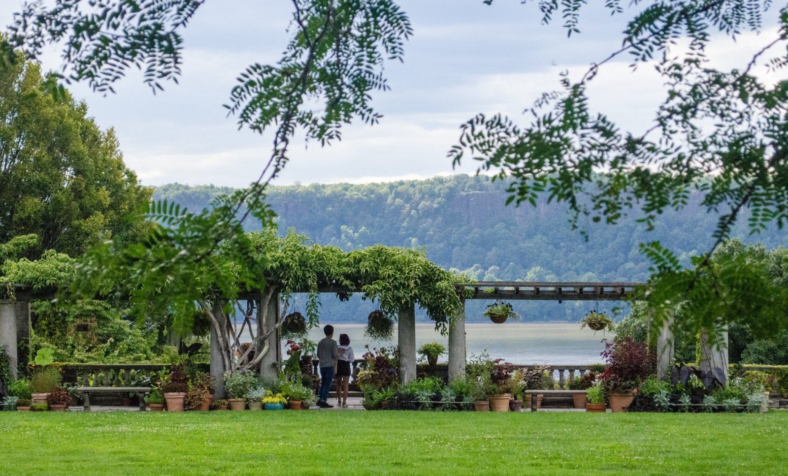
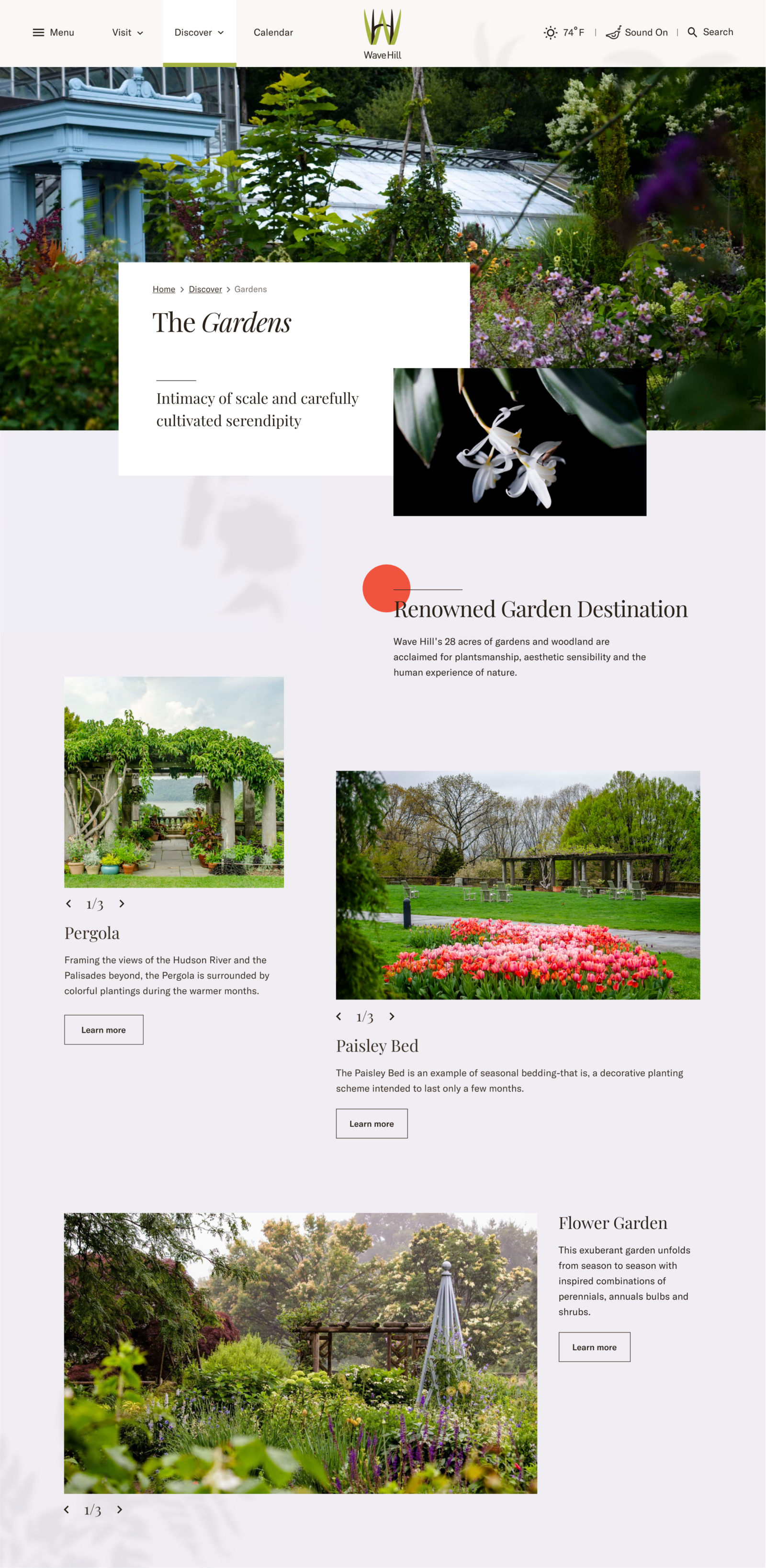
Our main challenge in redesigning the Wave Hill website was to convey the beauty and dynamism of an in-person visit. We went beyond photos and videos to create a sensory experience that mirrors the feeling of being there. The layout is open and airy, shadows of leaves and flowers appear throughout the pages, daily weather conditions are front-and-center, and an (optional) audio clip plays sounds of birds singing as you browse the site.
Section 2.More than just a pretty face
Beyond the gardens, Wave Hill has robust and dynamic programming for visitors of all ages and abilities. From contemporary arts to outdoor yoga to environmental education, there’s something for everyone.
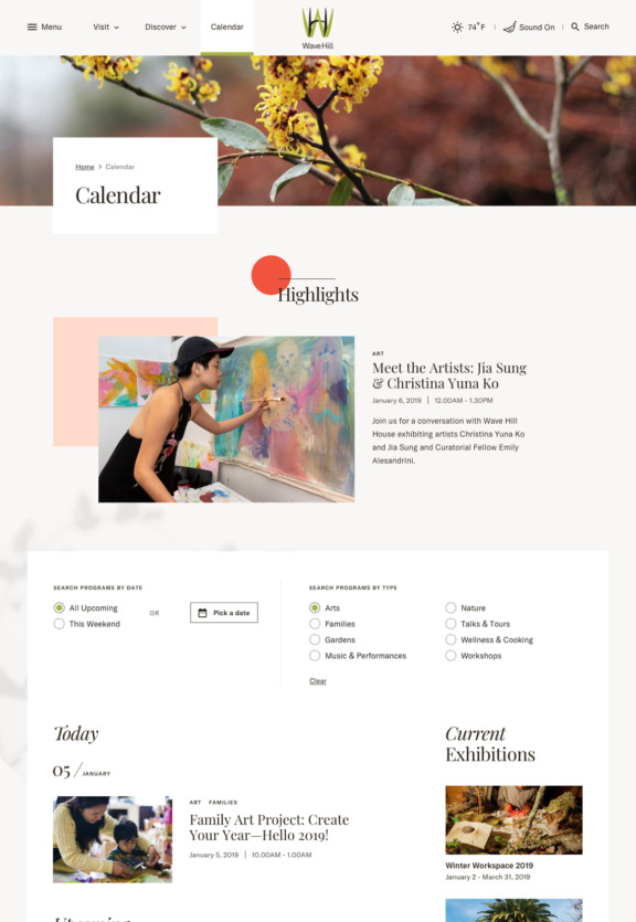
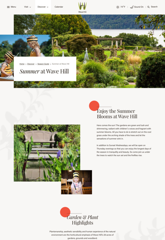
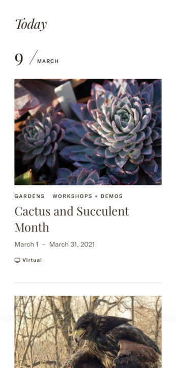
Our initial research and surveys showed that events and programs were the top reason people visited the Wave Hill website. So, we put programs at the forefront– highlighting what’s going on, building an easy to use calendar, and designing a bespoke Season Guide to promote all there is to do at any point in the year (yes, even in winter!)
Section 3.Seeding growth through gifts and membership
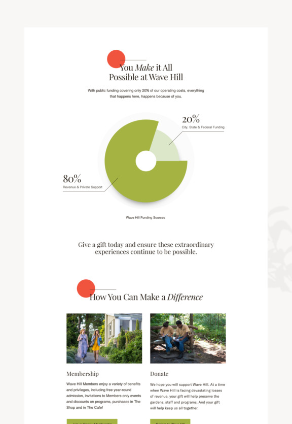
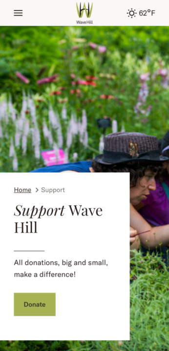
With public funding covering only 20% of operating costs, individual support is vital to Wave Hill’s future. We worked within their third-party donation platform to restyle transactional elements and forms to create a cohesive experience.
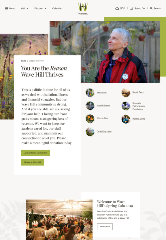
We also collaborated with their development team on an improved narrative for their Support page, and implemented that story through media rich, dynamic design.
