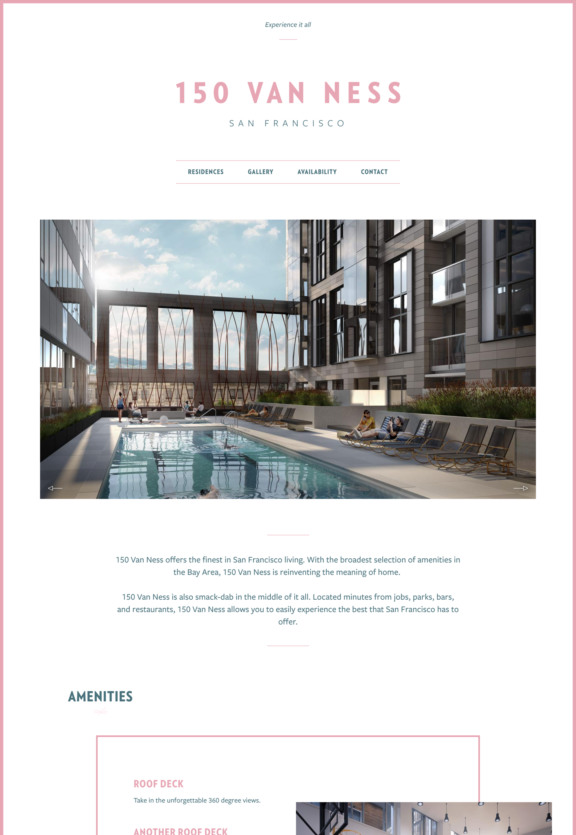
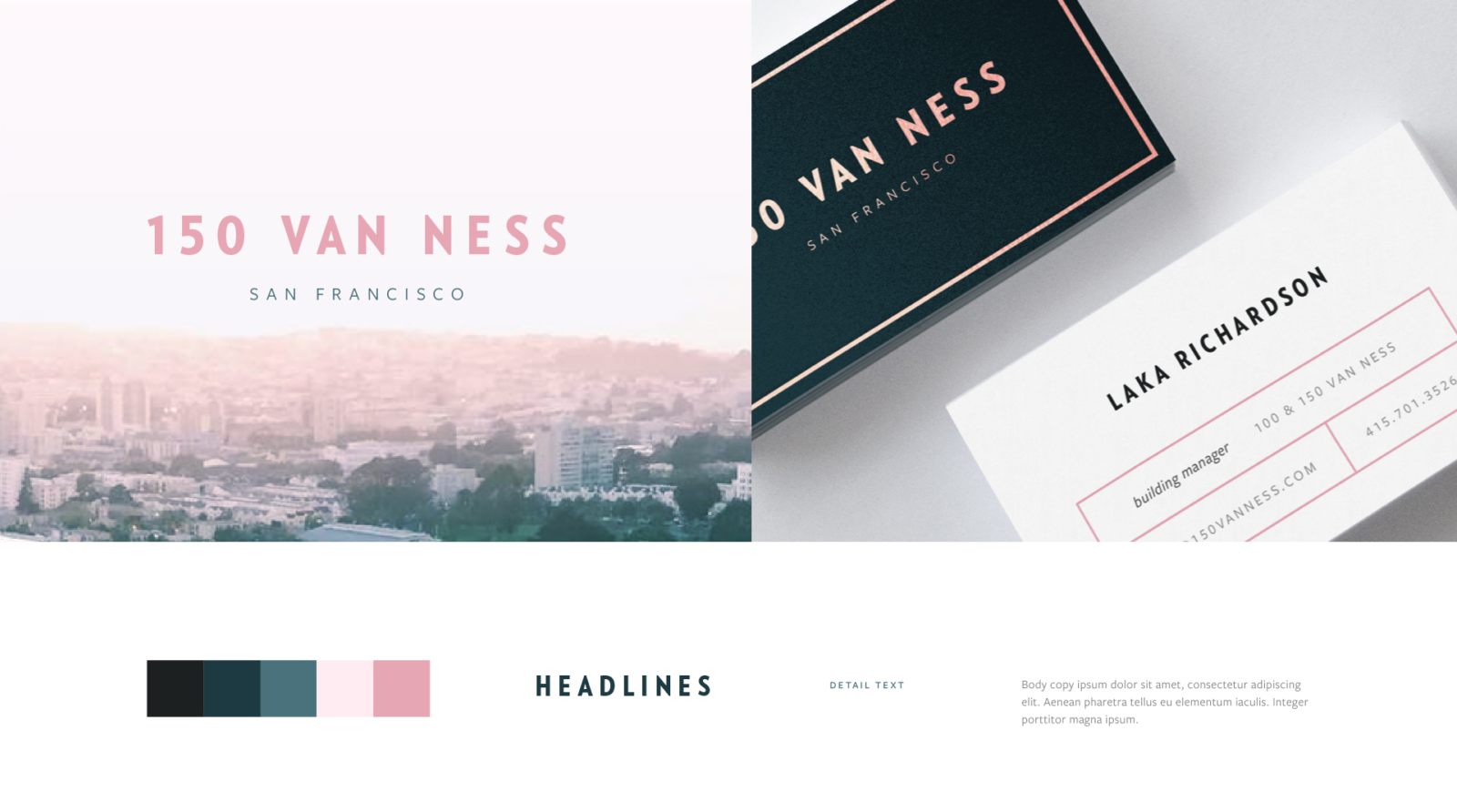
Continuing our long-standing relationship with real estate developer Emerald Fund, we created a luxe brand experience that captured the essence of their newest property, 150 Van Ness. As a sister building to neighboring 100 Van Ness, the project provided an opportunity to build on our existing work while creating something decidedly new.
150 Van Ness San Francisco luxury in a new light.
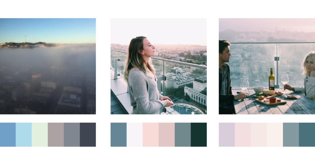
Section 1.Insta-inspiration.
Our design found inspiration in the Instagram images posted by residents of 100 Van Ness. Many showcased the dramatic views and signature colors of California light. We weaved these into the brand to create a distinct, new identity that resonates with its sibling.
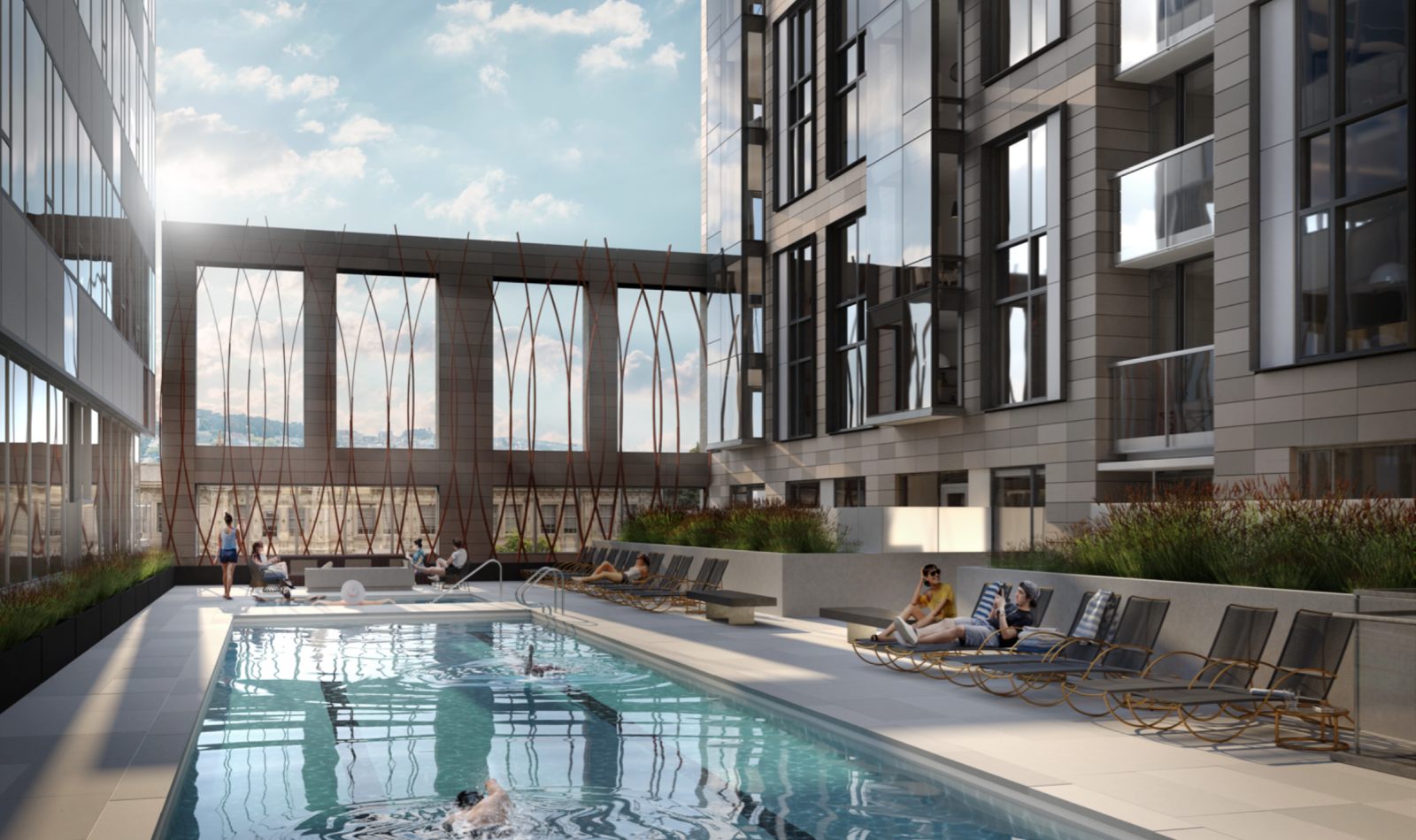
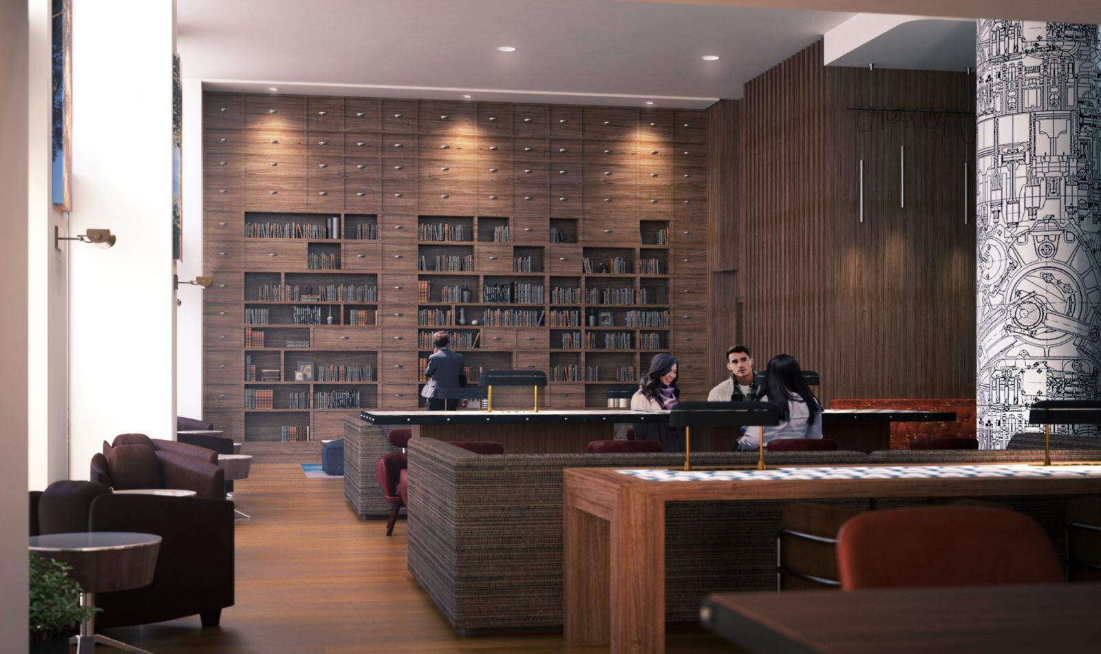
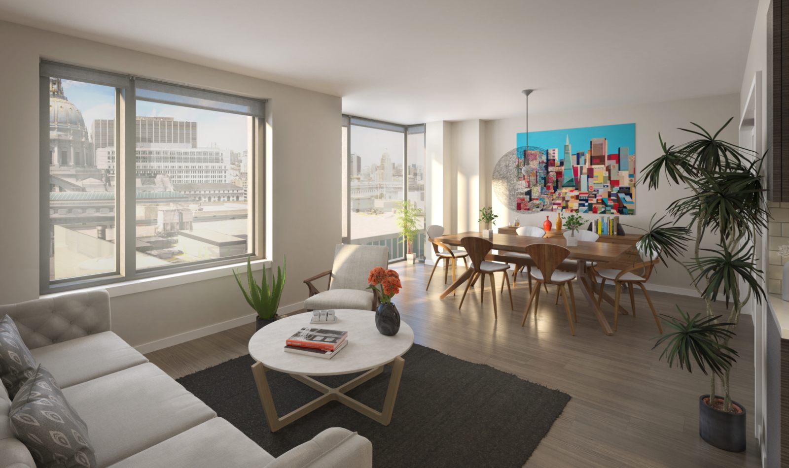
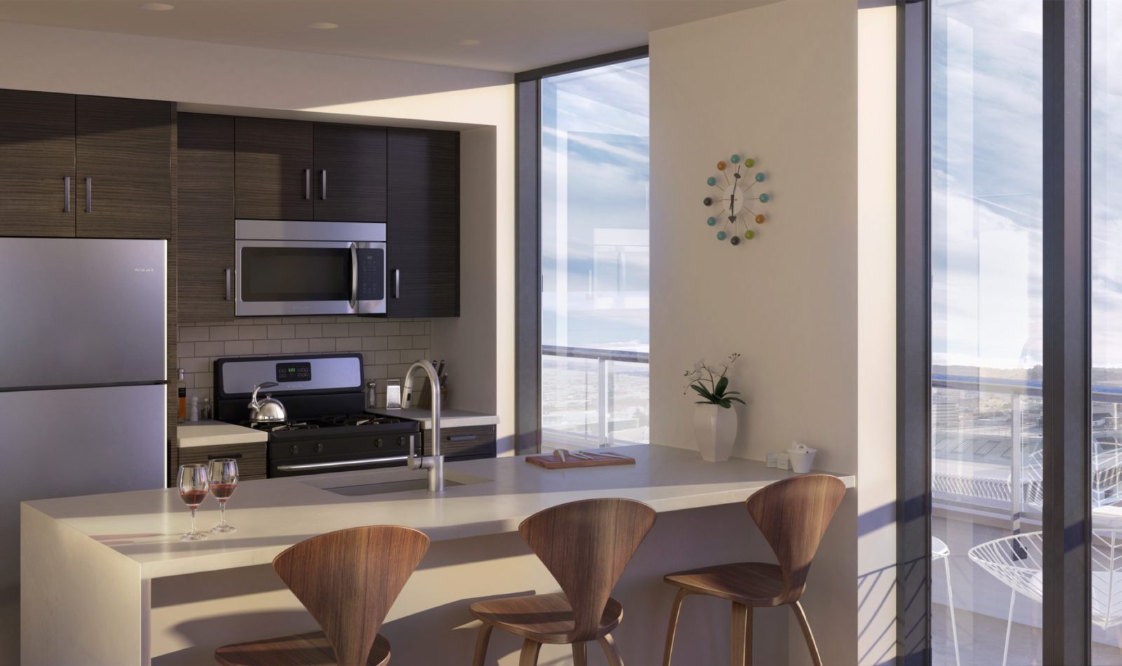
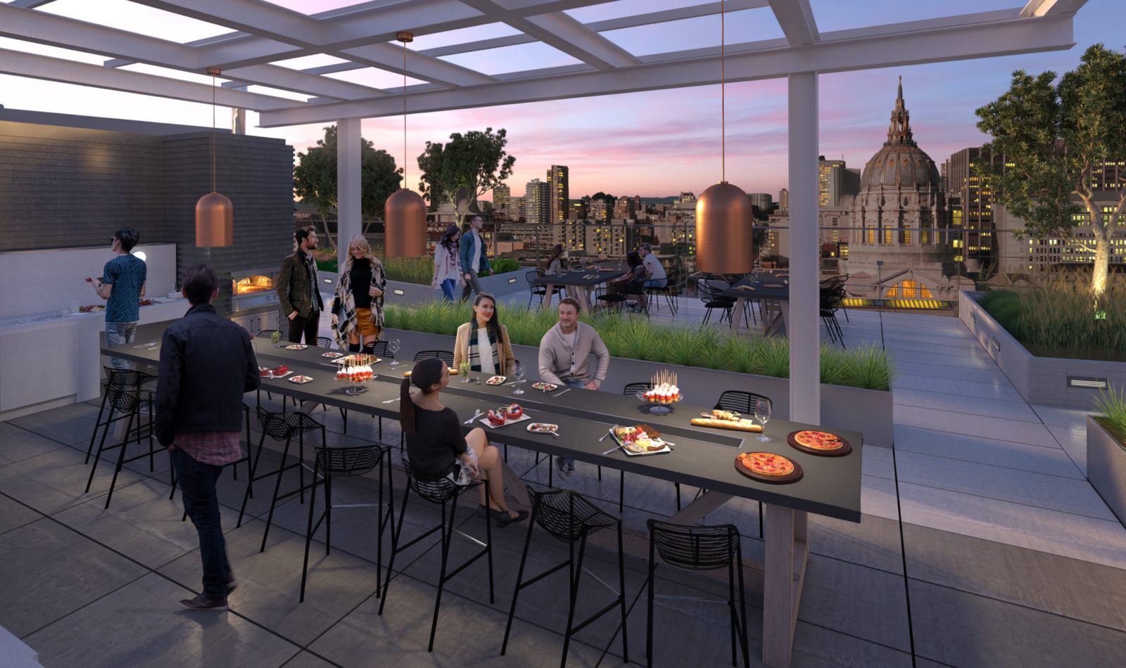
A story in images
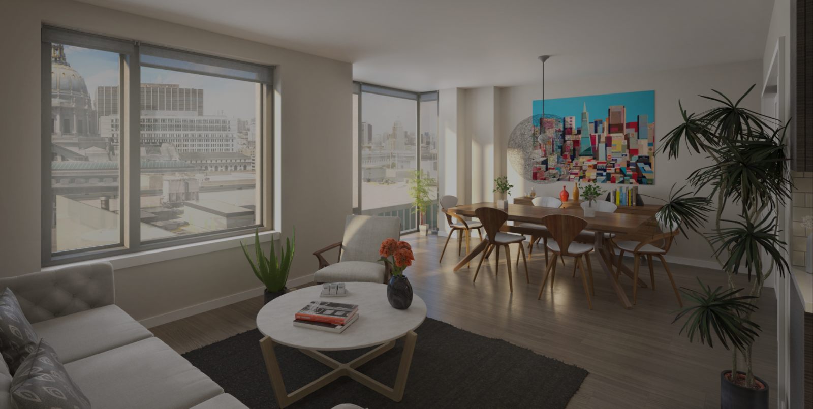
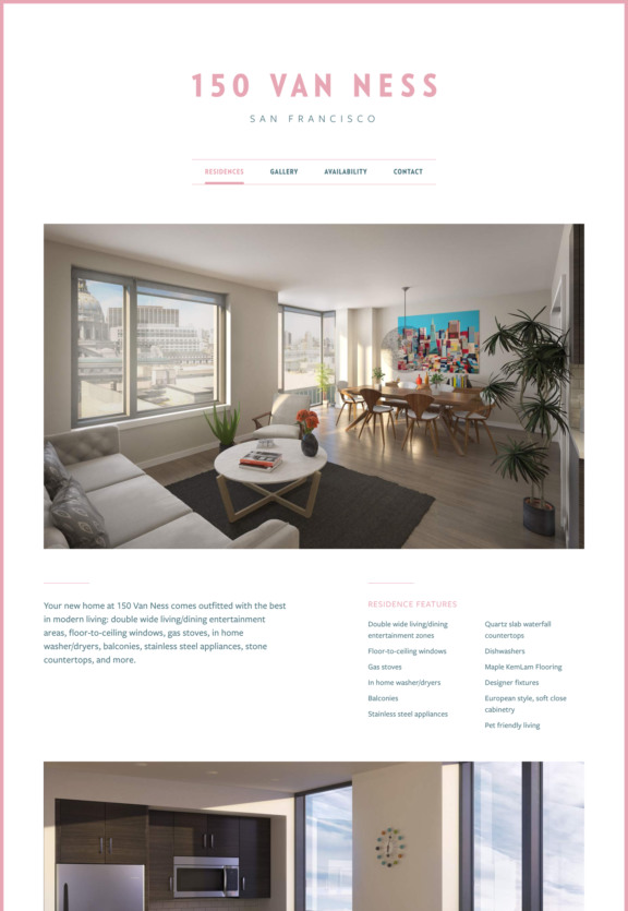
With our suite of renderings, potential renters can picture themselves in the space and envision their life at 150 Van Ness.
Section 2.Connection and possibility are at the core of what 150 Van Ness has to offer.
To emphasize connection to the city, we dispensed with the cliché “interactive map”, instead pioneering a more valuable experience for renters – the ability to preview their new commute to any point in the city.