Institutional Property Advisors Designing systems to connect investors and advisors

Advenir at Mansfield

Services

  • Research & strategy

  • User Experience

  • Web Design

  • Development

Institutional Property Advisors (IPA) crafts customized real estate strategies for institutional and high-net-worth investors. IPA turned to the Foundry to bring an archaic website into the modern era, and we created a best-in-class resource for long-standing clients, new investors, and future advisors alike.

To meet the expectations of today’s investors and agents, IPA needed to streamline the visitor experience of the website, create a consistent experience across desktop and mobile devices, and refresh its visual design to reflect recent updates to the brand direction. The new website quickly funnels experienced users to the content they seek while welcoming and orienting first-time visitors.

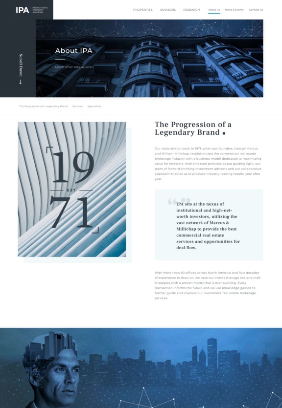
1a About us
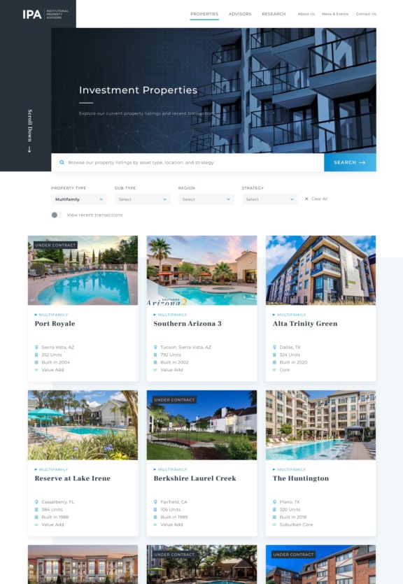
1b Investment Properties

Section 1.Streamlining pathways to key content

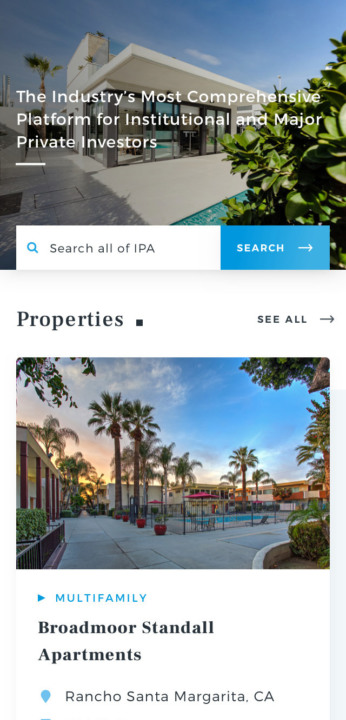
The new homepage leads with IPA's three pillars – properties, advisors, and research – and an invitation to search, letting site visitors cut to the chase. With each visit, personalized content blocks serve more relevant properties, research, and news.

We carefully evaluated the needs of each audience, organizing content to encourage visitors to move fluidly from properties to agents, teams, and research reports.

Section 2.Connecting advisors to clients

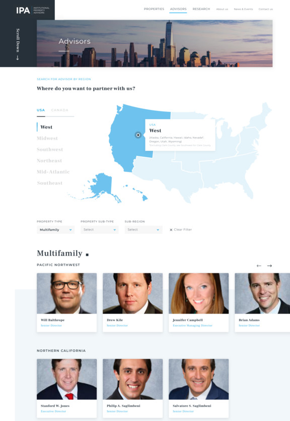
Advisors are the heart of IPA, and a crucial pillar of the company’s growth strategy. We designed a tiered search experience that guides visitors to the right advisors based on regional location and property types expertise.

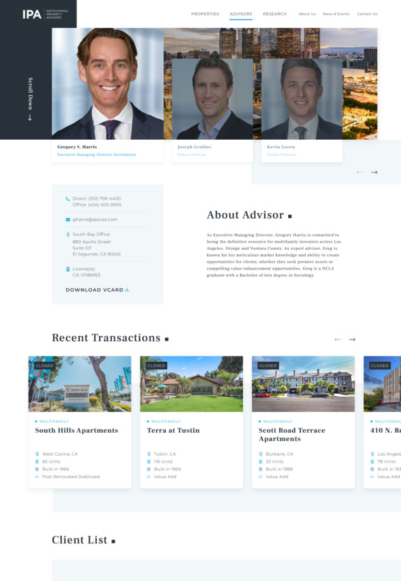
Advisor pages seamlessly present affiliated team members, recent transactions, selected clients, and related news and research to convey the depth and breadth of support investors can expect.

3a Advisors
3b Individual advisor

Section 3.Designing a system to produce results

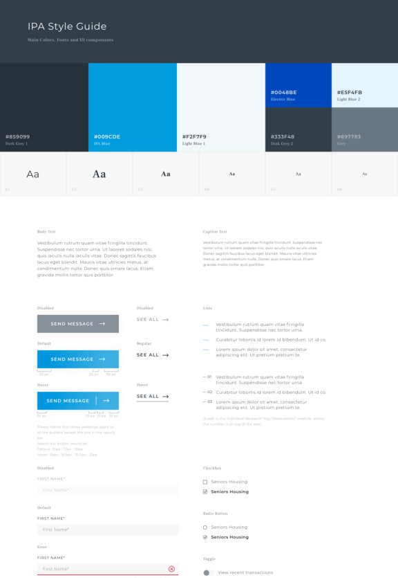
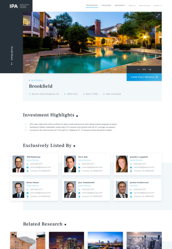
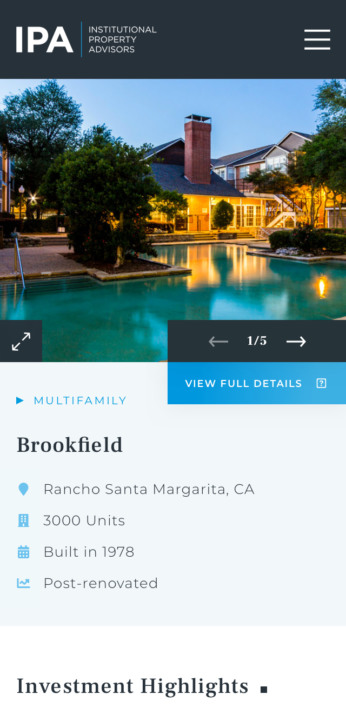
Our collaborative, sprint-based approach focused on crafting modular structural elements with consistent visual treatments. Behind the scenes, this paved the way for future site evolution and streamlined content management workflows; for visitors, it ensured the site was easy to use, helping keep their focus on viewing more content and taking key actions.

4a Style Guide
4bb Individual Property
Phone Nav 02
Phone Home 01 CROP 2
5c Individual Property

Similar, but different