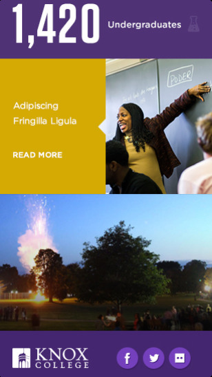
Located in a small town three hours outside of Chicago – Galesburg, Illinois – Knox College needed to dramatically upgrade its website and brand presence to compete with other liberal arts colleges. We helped Knox showcase that it didn’t need an urban campus by accurately portraying its forward-thinking ethos and culture, driven by energetic faculty, staff, and students.
Knox College A new edge for a vibrant educational institution.

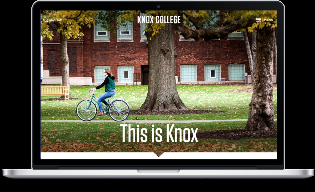
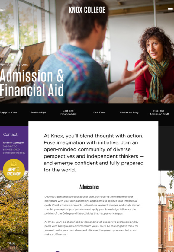
The Knox admissions office was looking to more effectively target students in its applicant pool and boost applications overall. Faced with a short runway before the impending admissions cycle, we initially focused resources on a cosmetic refresh of top-level landing pages and the admissions funnel, delivering record engagement resulting in gains in both quantity and quality of applicants. From that foundation, we reorganized and redesigned the entire site, sending a message to prospective students – Knox is dynamic, fresh, and relevant.
Section 1.Over 3,500 applicants for first time in history.
Making waves at a historic institution like Knox College is a tall task. By redesigning key landing pages and the entire admission pipeline, we communicated the Knox brand on pages where it mattered most and provided clear calls-to-action for next steps. Prospective students received the message loud and clear, and in record numbers.
Section 2.11% increase in offers of admission.
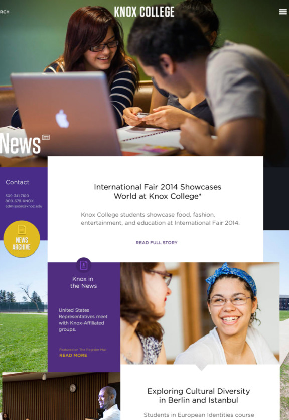
Without clear and accurate messaging schools don't generate quality leads. Today's Knox College shines through from the moment a user lands on the homepage. From student diversity to the price of pizza at the local shop, we authentically captured the campus and its community. The result – more applicants; better-matched students. Knox sent out a record-setting 2,240 offers of admission, to a pool of students with higher academic profiles and greater diversity than ever before.
Section 3.-1,000 pages, +23.7% mobile session duration.
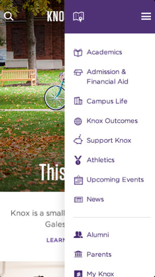
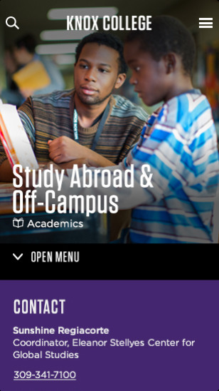
To focus on the primary audience – prospective students – we overhauled the Knox homepage, eschewing long pieces of copy and ineffective image carousels in favor of a page flow bursting with engaging imagery, intriguing statistics, and clear calls to action. We also moved over 1,000 pages to an internal portal for faculty, staff, and current students. The result? A site optimized for students on the go, with a 23.7% increase in session duration for mobile devices and a 19% decrease in homepage bounce rate across all devices. Visitors stay longer and consume more content than ever before.
