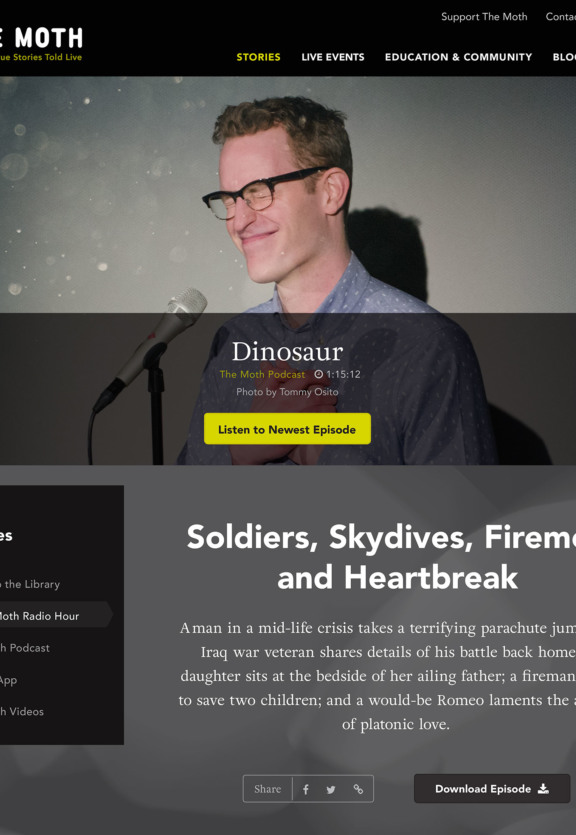
Brooklyn Digital Foundry partnered with storytelling non-profit The Moth to rethink how it engaged with listeners online. We transformed its website into a rich content destination — one that empowers its deeply invested fan base to better engage with The Moth's full library of stories.
The Moth Connecting listeners to stories around the world.

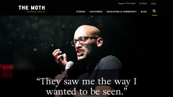
Section 1.Now with 1.2M users and over 7M stories.
The Moth’s programming has expanded considerably since 1997, yet its website wasn't able to keep pace. It lacked an optimized user experience that easily conveyed the breadth of The Moth’s incredible offerings. Another key problem: users who were spending an (incredible!) average of 18 minutes on the site needed more nuanced access to its full catalog of recordings.
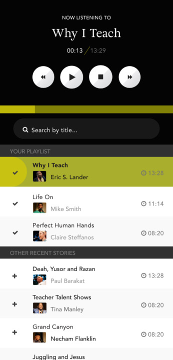
Section 2.A complex audio player for easy listening.
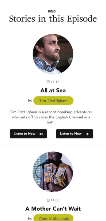
To enable users to discover new stories and re-discover old favorites, we created connections across The Moth’s full library of content and built a robust filtering and search model supported by metadata tagging. We indexed The Moth’s full story repository, breaking down content into digestible chunks so that users could create their own “playlists of stories” instead of wading through hour-long streams to find their favorite segment. The design features immersive imagery to fully capture the experience and emotion of active storytelling. We also built a custom audio player that lets listeners track their favorite stories.
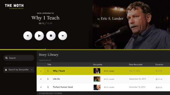
Putting users in control.
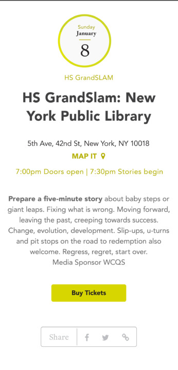
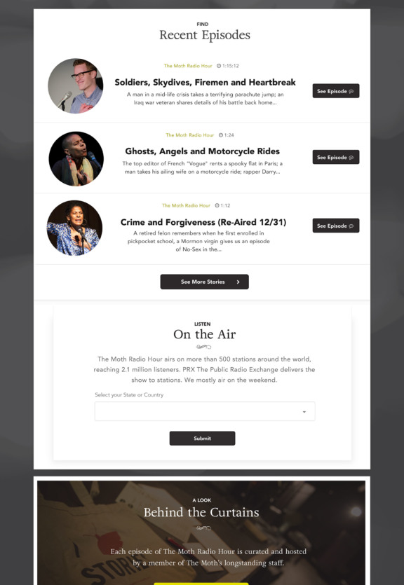
The new Moth suite empowers users to filter, browse and select the stories that interest them the most. The site presents a cohesive visual identity communicated through a modular site structure that allows the Moth team to easily update content in real-time. We’re especially thrilled that the show's invested fan base has given our redesign rave reviews across social channels.
