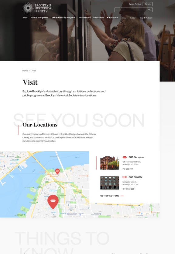
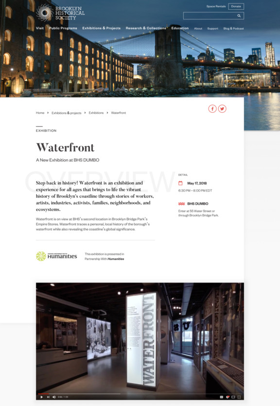
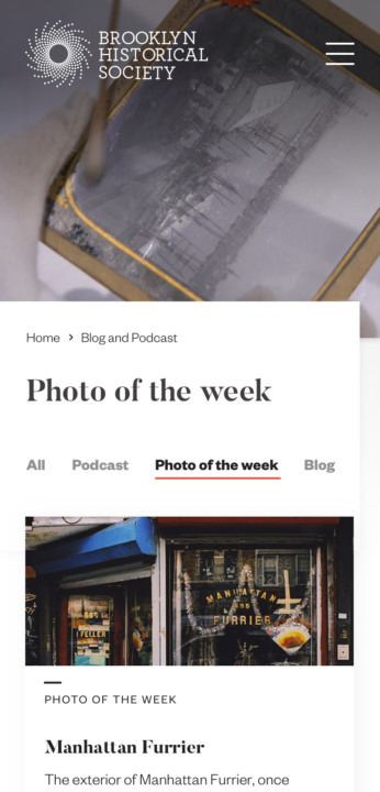
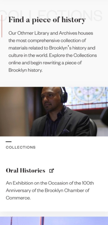
We redesigned the Brooklyn Historical Society website with an eye for dynamism, helping the organization share unique perspectives on why the borough’s history is so relevant for today’s communities.
Brooklyn Historical Society Shaking the dust off Brooklyn’s past
Section 1.A fresh new look.
History often gets a bad rap for being stuffy and dusty; the Brooklyn Historical Society is anything but. We translated their progressive identity into a modern, dynamic design that invites people to explore.
Section 2.An open invitation.
With a target audience as diverse as Brooklyn itself, we wanted the website to feel open to all – not just academics. Warm, welcoming language playfully orients users, while iconography and clear organization of key information ensure visitors can access the information they need.
Section 3.Making history tangible.
The existing BHS site served a primarily informational purpose, relying on the user to know what they’re looking for. Our solution prioritizes visibility of the quality resources and innovative work that BHS does. Through a refreshed information architecture and thoughtful content narrative, the new site more fully conveys the broad scope of what BHS has to offer.
